Saturday, 16 November 2013
Thursday, 14 November 2013
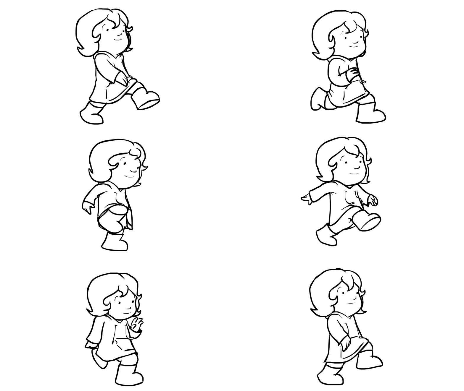
After Effects test for Pups
Plan view for the park
The camera for the establishing shot is in red. I wanted the path to be at such an angle as to warrant an establishing shot that would show some hint of a street behind the trees - perhaps the street in the earlier scene itself.
Using this plan, we can figure out the more cinematic camera angles that occur in the climax of the film.
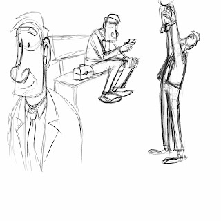
Further developments with the tall man
 I've been developing the character of the tall man further this week. As his design was completely changed at a late stage, I wanted to dedicate a substantial amount of extra time to getting accustomed to his new features and personality. He's much jowlier now, his face elongated to exaggerated his more hangdog expressions. His eyebrows are thick and rectangular, able to give a broad range of expression to the face. He carries a lunchbox, which becomes the focus of his attention when he's sat on the bench, moments before realising the little boy's in peril. The lunchbox is a nice visual hint to the fact that he's a working man, perhaps bored and disillusioned with his job and of adult life.
It's taken us a ridiculously long time to realise how much the tall man of our film looks like the actor Walter Matthau! As soon as this bombshell successfully detonated, I set to work compiling appropriate facial expressions.
Wednesday, 13 November 2013
Friday, 8 November 2013
Thursday, 7 November 2013
Kicking it into fifth gear
Fifth gear's the fast gear, right? I don't drive. Never mind.
I've continued solidifying the aesthetic of the film. Firstly, I drew a plan of how the street environment would look, so Jake could model it in Maya. However, it became clear pretty quickly that what I was plotting out was bland, repetitive and devoid of any personality.
Actually using the theoretical 'inspiration' for the film's aesthetic, Disney's One Hundred and One Dalmations, for genuine, not-saying-things-for-the-sake-of-it inspiration, I redesigned the street. The improvement is plain to see.
I then set my focus back onto that of the man. Here's a quick character sheet.
I've continued solidifying the aesthetic of the film. Firstly, I drew a plan of how the street environment would look, so Jake could model it in Maya. However, it became clear pretty quickly that what I was plotting out was bland, repetitive and devoid of any personality.
Actually using the theoretical 'inspiration' for the film's aesthetic, Disney's One Hundred and One Dalmations, for genuine, not-saying-things-for-the-sake-of-it inspiration, I redesigned the street. The improvement is plain to see.
 |
| Let this be a testament to the importance of good research. |
Subscribe to:
Comments (Atom)


